Forellerie
Get to know the full case, details and more
scroll down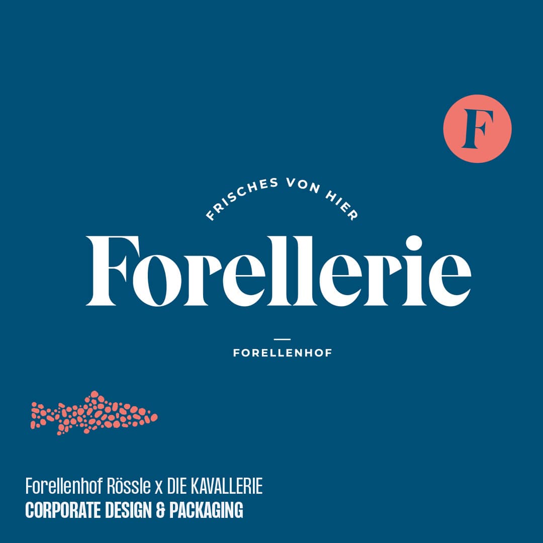
The project
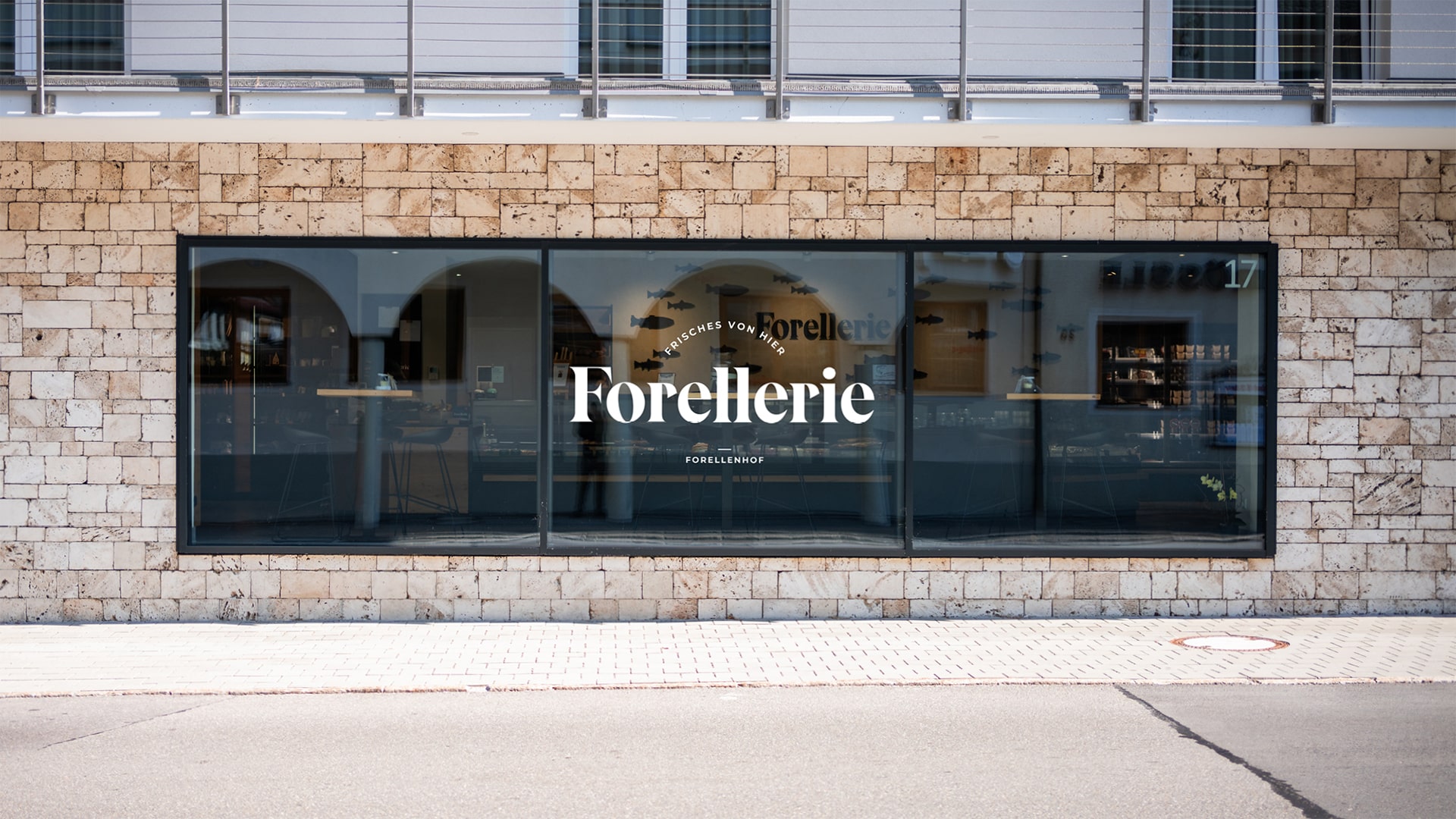
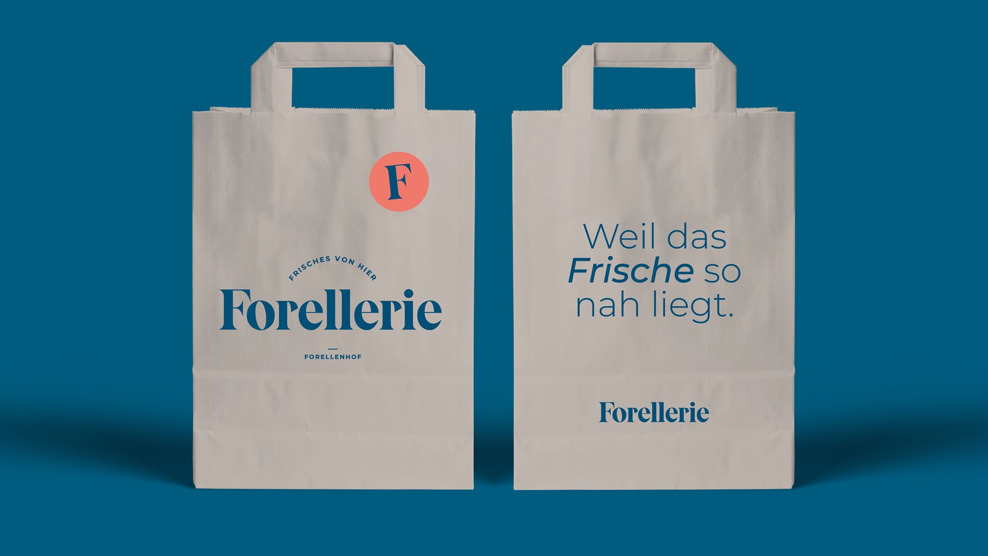
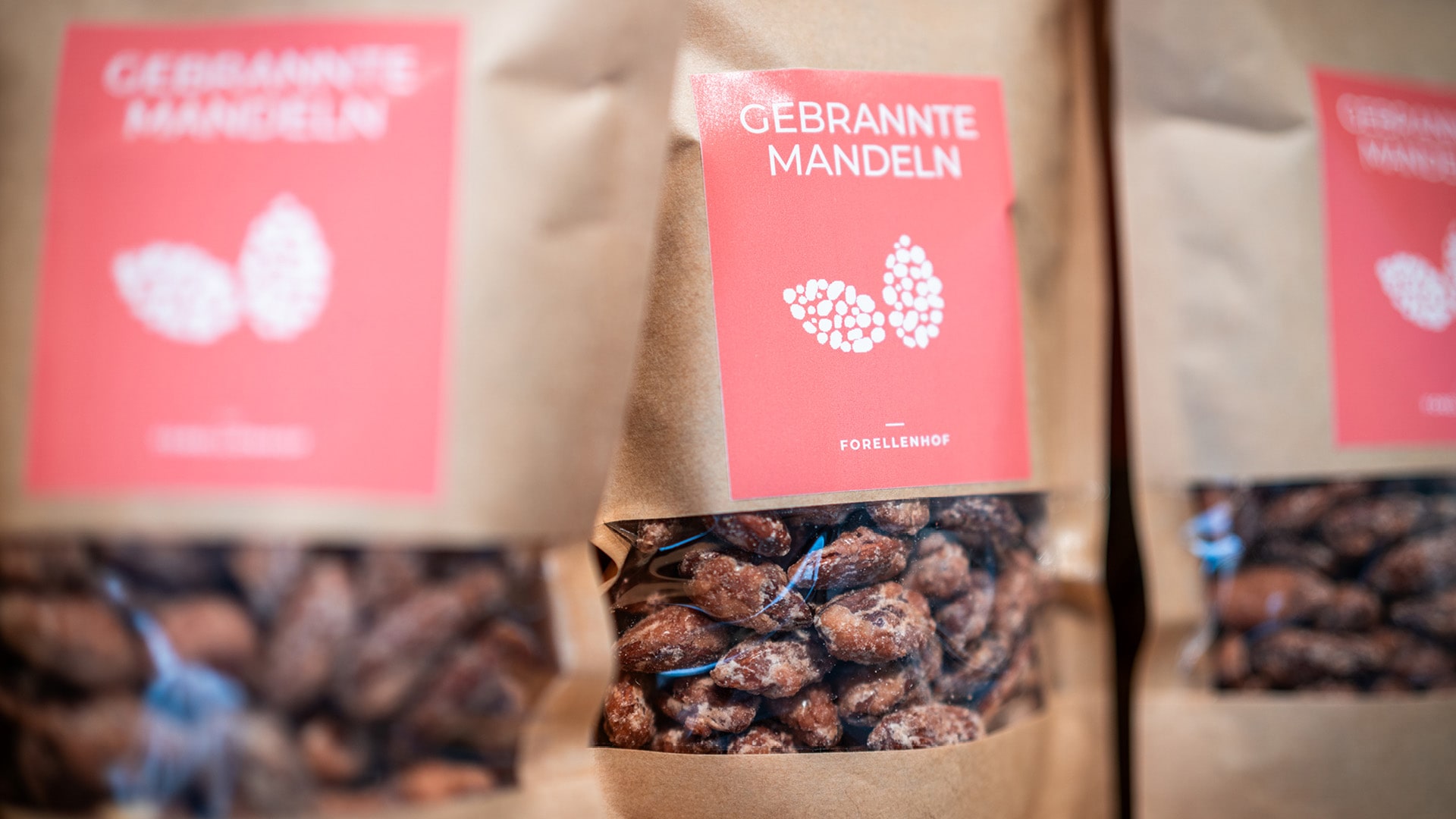
Our task is the development of the naming and logo, as well
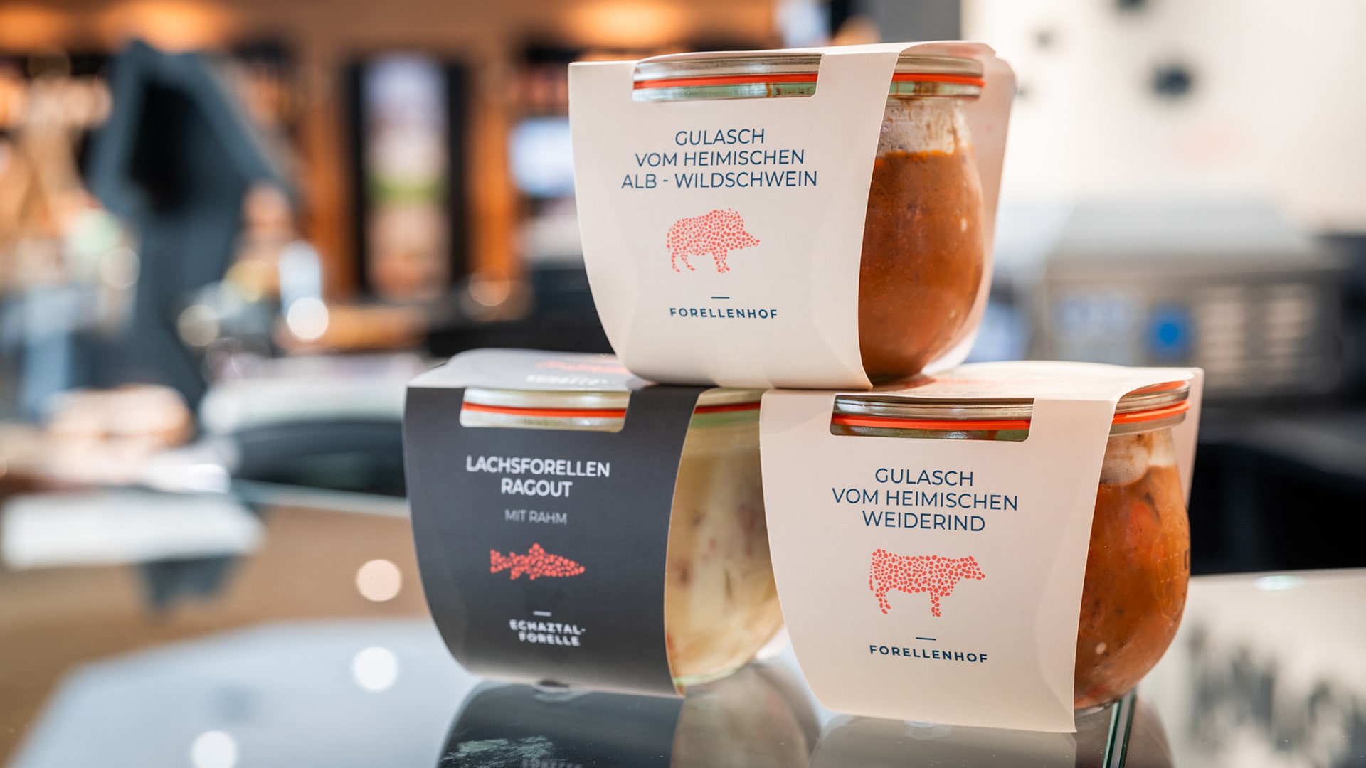
as the packaging for the diverse regional products and the corporate design.
The Challenge
The store should establish itself as an independent, regional delicatessen
and yet not lose touch with the Forellenhof’s superior brand and the
already strong positions of the trout farm and hotel.
The Solution
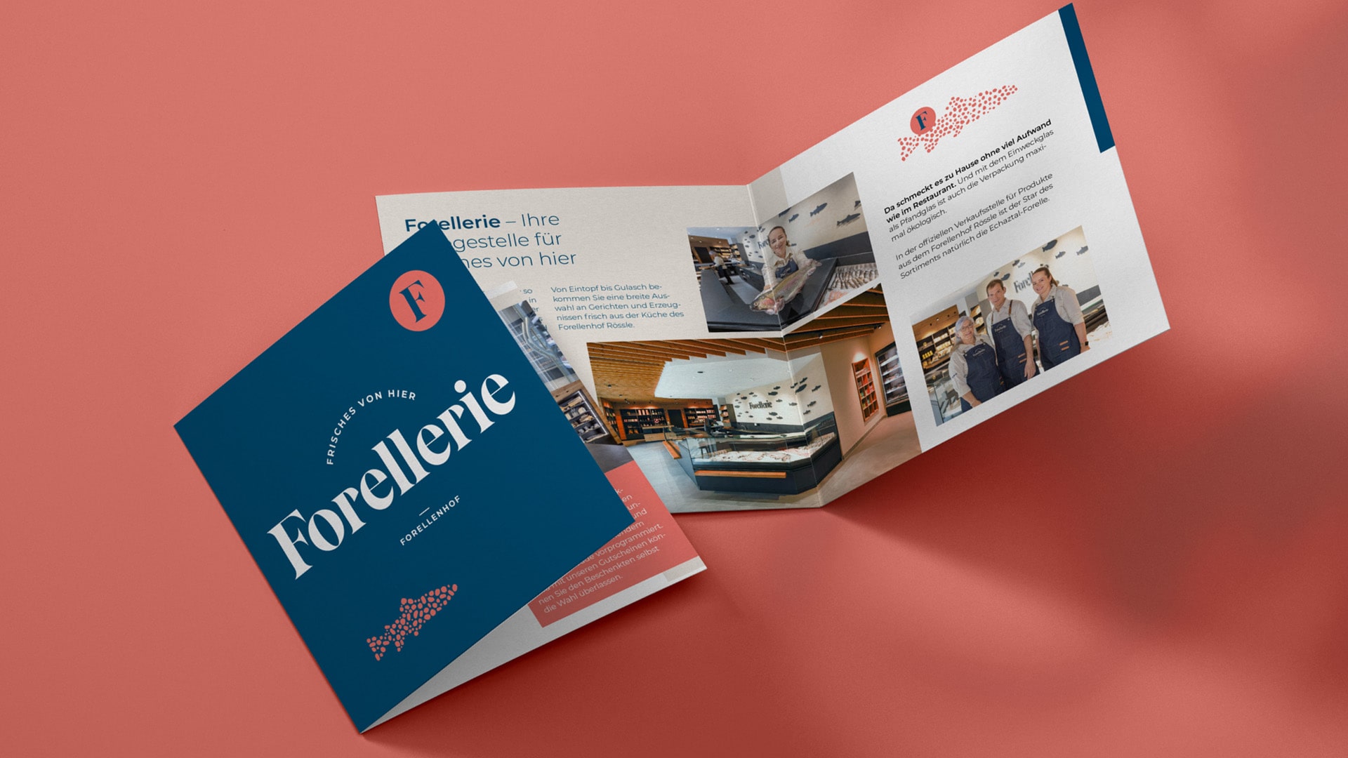
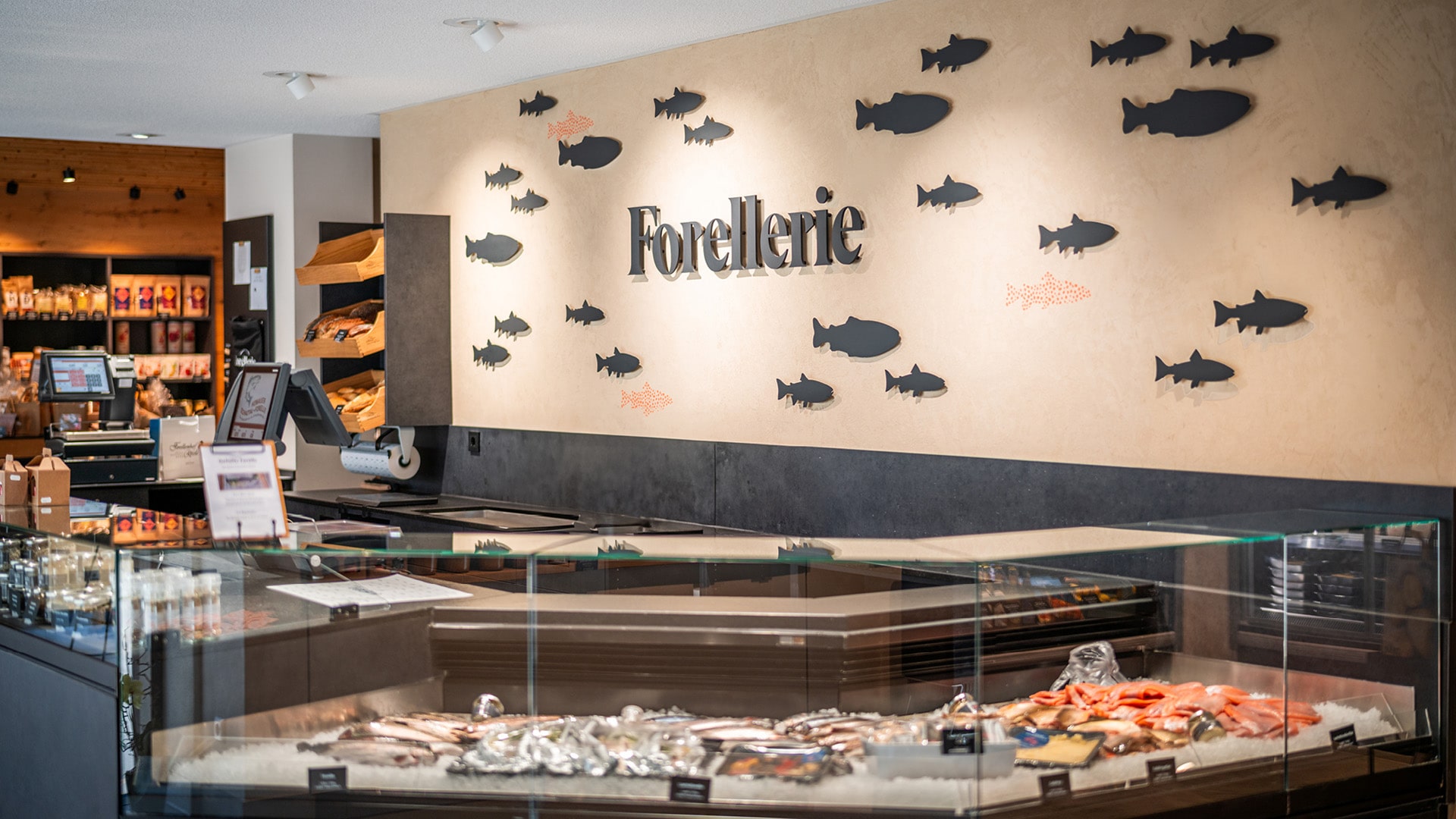
The dotted skin of the trout flows throughout the design language as
the main element – almost all products, logos and visuals incorporate
this inspiration. The modern design and relaxed tonality combined
with retro influences make for a fresh look; at the same time,
they pay homage to the long-standing tradition.
The Result
Our fresh design manages the balancing act between tradition and
modernity. Sustainable packaging, banners and flyers successfully
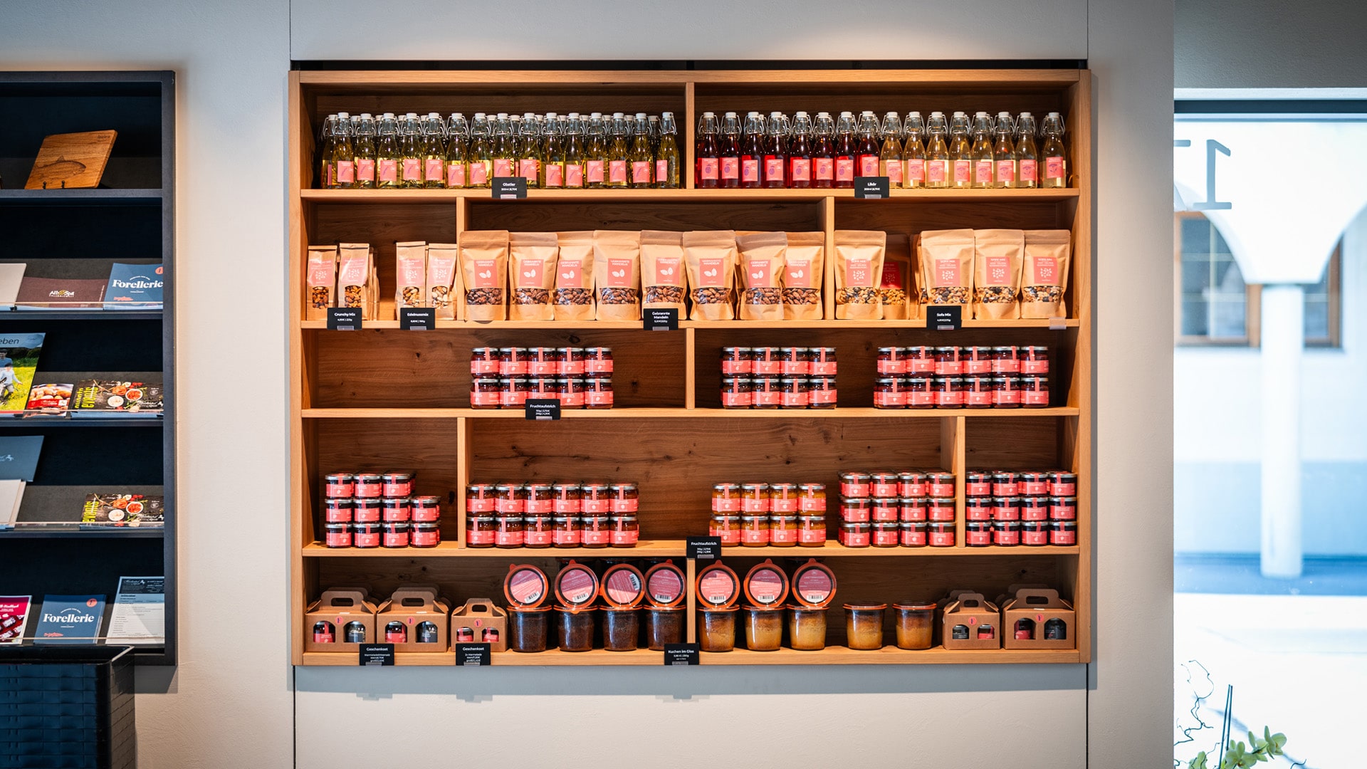
position the new brand. Thus, a place for regional products and
local produce is created, which attracts regular customers and tourists alike.
