Landratsamt Reulingen – Corporate Design & Logo by DIE KAVALLERIE
Get to know the full case, details and more
scroll down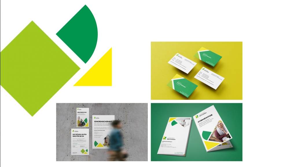
Landratsamt Reutlingen: Logo & Corporate Design
The project
Landratsamt Reutlingen took a look at their previous corporate design and then asked themselves a few questions: How are they perceived so far, where are their strengths and which characteristics do they want to communicate even more to the outside world?
The Challenge
Parking tickets and long waiting times – that’s what people have in mind when they think of a an administrative body. This was not only shown by a qualitative street survey, with which we gained an initial impression of their image. A brand workshop with employees also revealed strengths and weaknesses.
The Solution
A survey we conducted among employees showed which values and competencies are particularly important to them. They wanted to communicate these to the outside world. That’s why these qualities set the tone for us for the rest of the process. We also conducted a street survey to find out how well known the current logo of the district office actually was. This gave us greater freedom in developing the new corporate design.
The Result
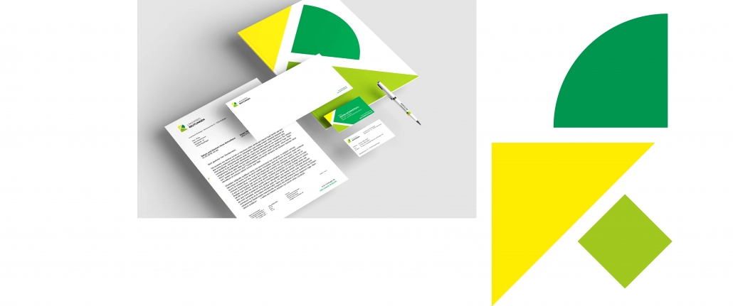
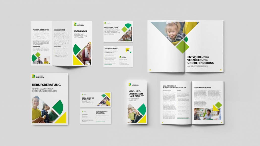
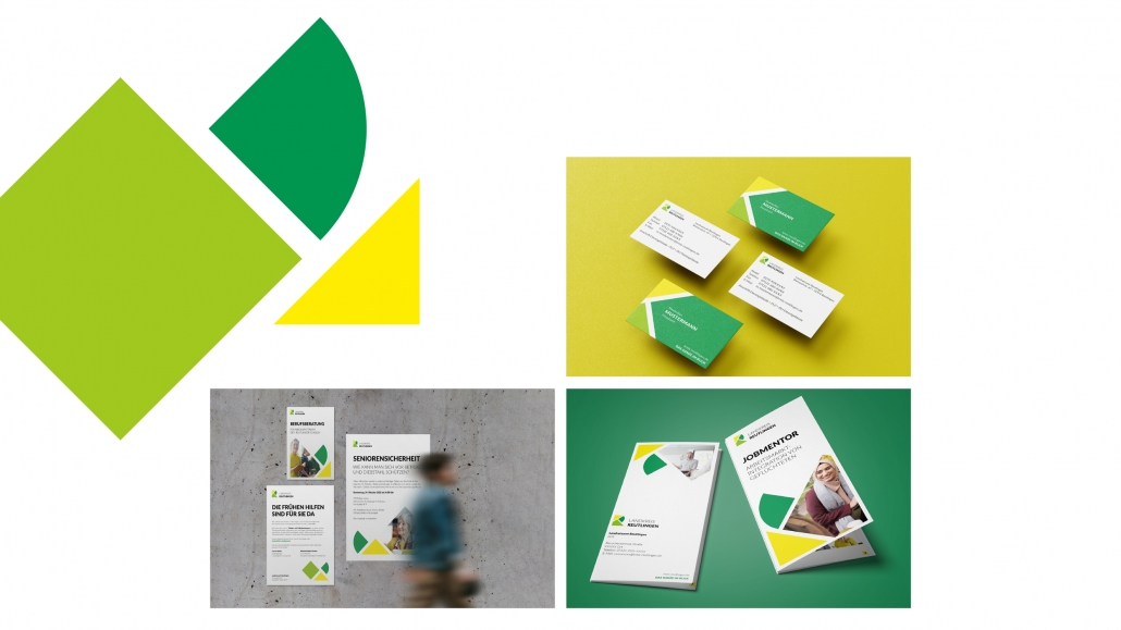
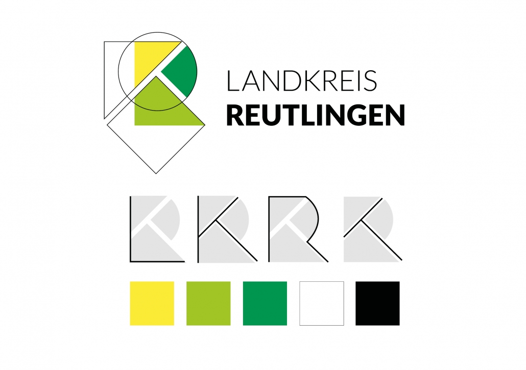
A county that is made up of many different areas. A district office that keeps many details in mind. Colors and shapes that should convey certain characteristics. From these specifications, we developed a new logo as part of the CD, which is based on the previous colors of the Reutlingen district office. And we developed a claim that sums it all up: The whole picture in view. With this, we are now implementing the new corporate design.
The new appearance of the Landratsamt was unveiled to employees at their summer party.
