Safety and Security
Get to know the full case, details and more
scroll down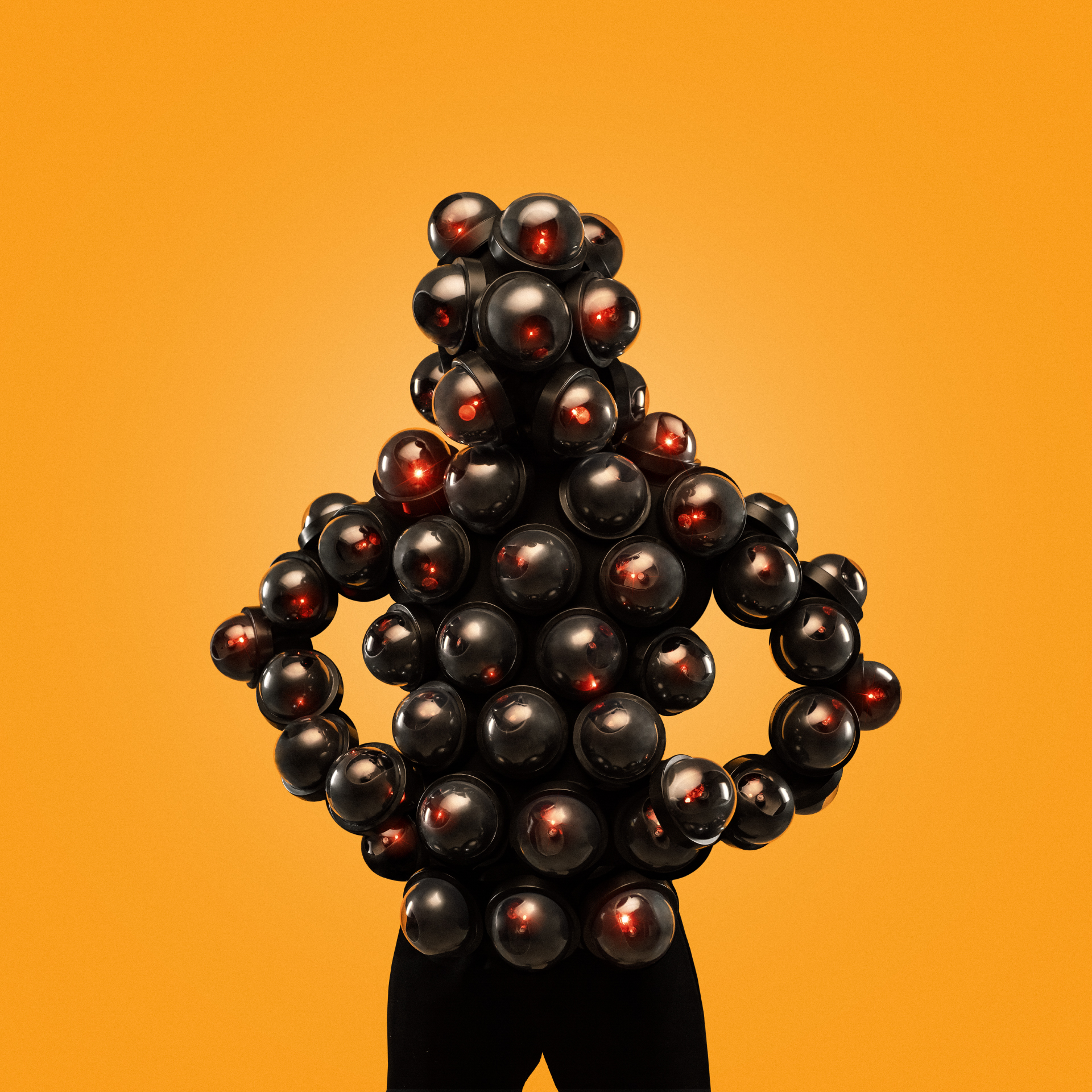
The project
Our task.
Our acquaintance with the company began with the request to create the name and the identity for the new line of their products – systems of their own security alarms. Once the first project had been successfully implemented, we understood that we could be useful not only in the development of the new product brand, but also with the general repositioning of the whole company.
The main reason of the new project was the evolvement of new companies in this sphere which had quite aggressive marketing campaigns. As compared to them, the positions of “Safety and Security” looked not so prominent even despite the long-term expertise and scale. The company did not have any clear position, its marketing activities were limited to a scope of quite standard formats and the design had never been updated before.
That was the start of a long and interesting process of rebranding of the oldest security agency in the country.
The Challenge
Once the first phase of immersion and analytics was completed, we had a strategic session with the board of directors and came to managed to understand the peculiar feature of the company which previously remained unnoticed
Speed. The main thing that characterizes any security agency. The speed of reaction and the speed of arrival of the security unit. The speed itself is the indicator of how competently the processes are built within the company, how prepared the staff are and how many security units drive around the streets of the city at the same time. Throughout the long-term period of its operation, “Safety and Security” has invested funds and efforts to arrive at the crime scene in the shortest possible time – within 3-5 minutes. Quite a few other companies are able to ensure such level of operational efficiency.
The Solution
We really wanted to overcome this injustice and turn the company into a special service. At least from the visual point of view.
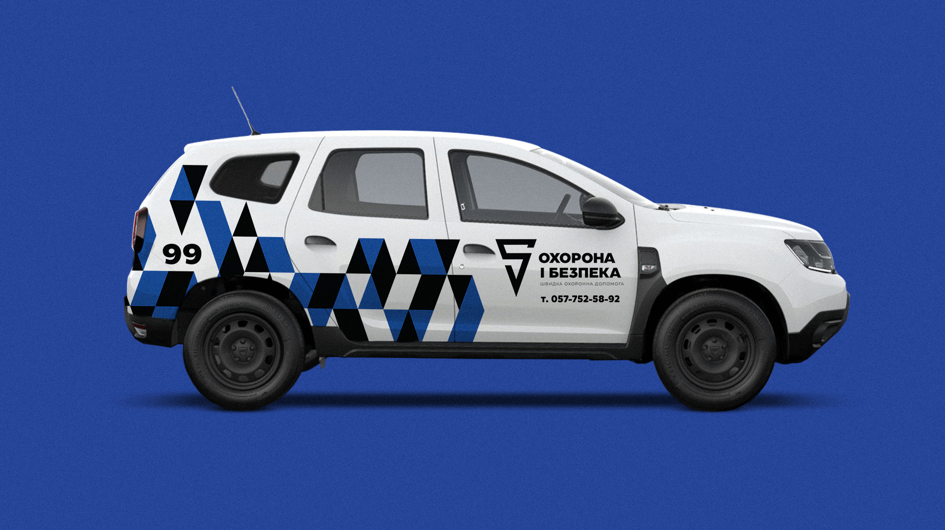
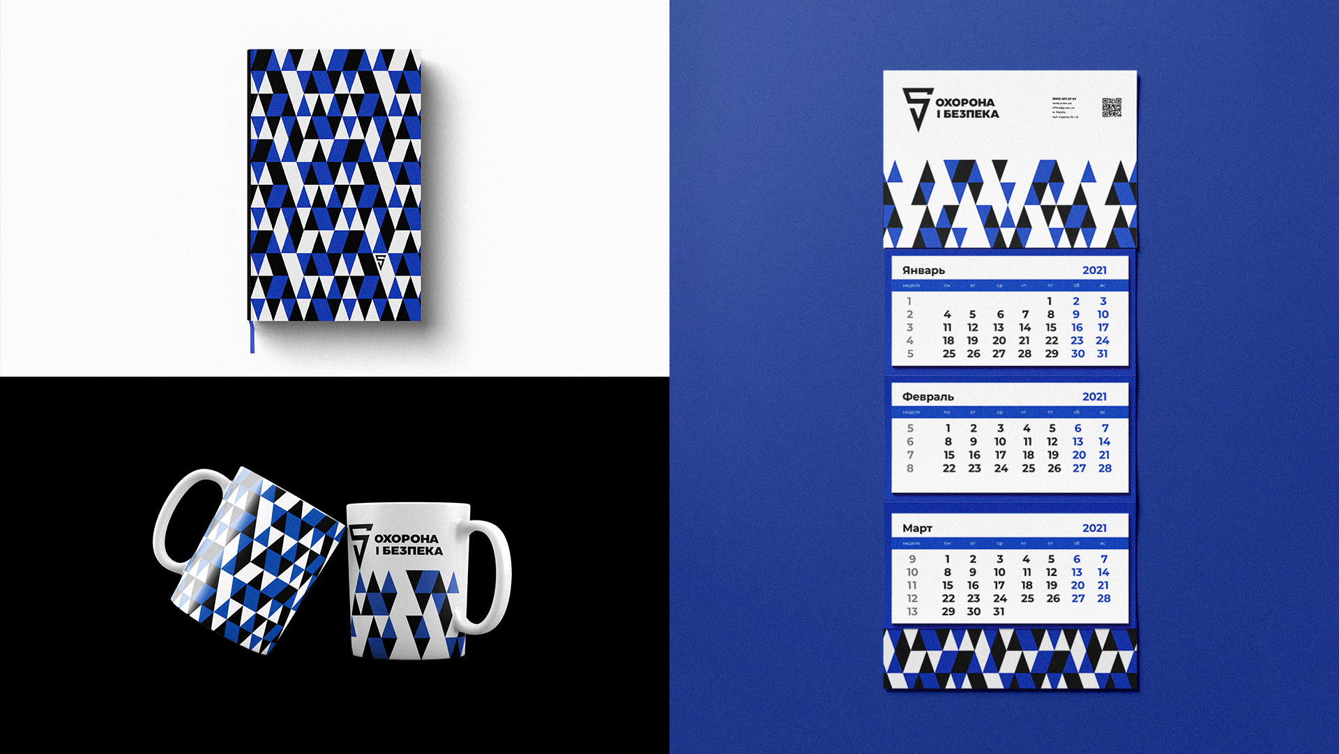
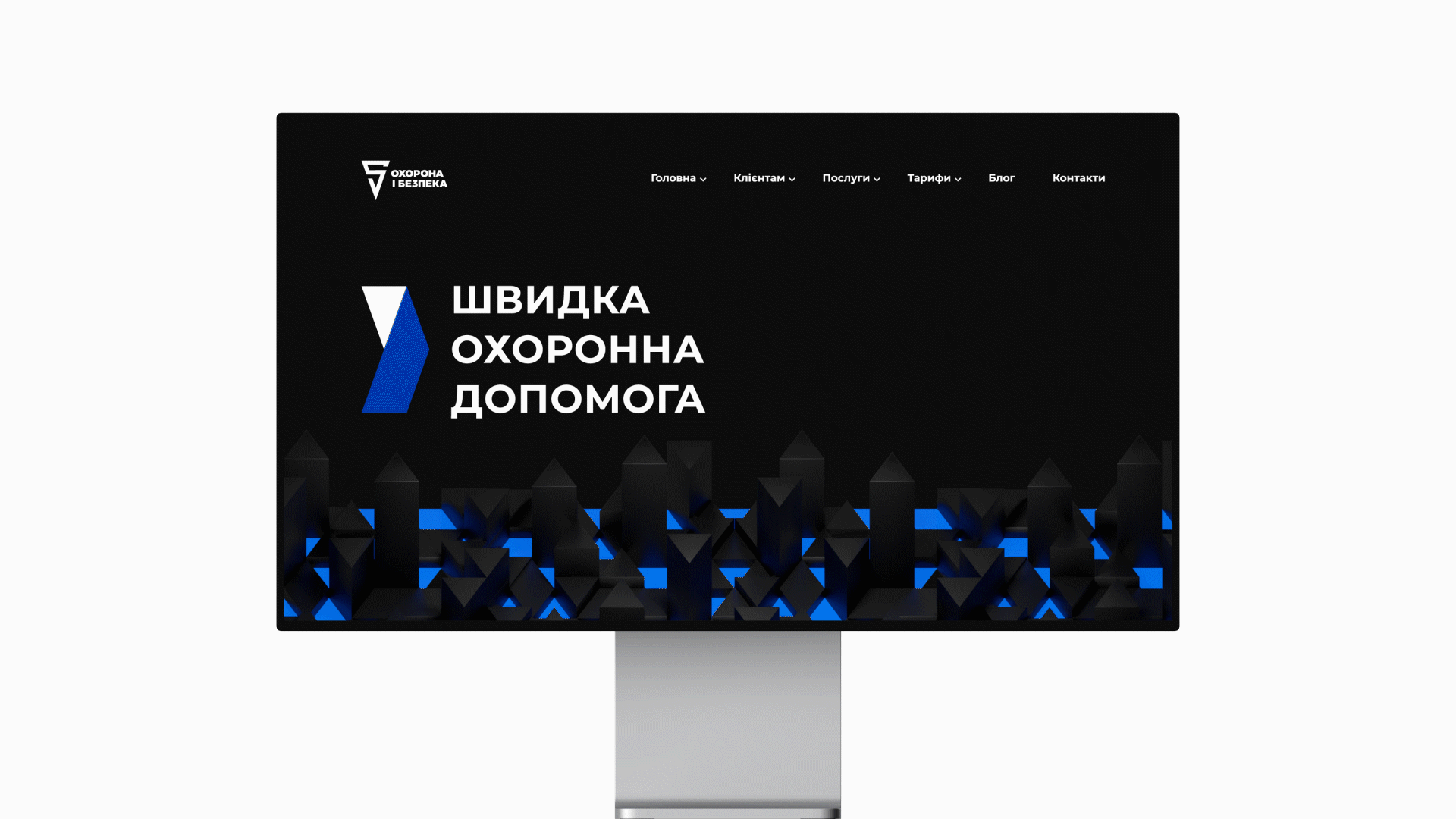
This was the origin of the idea of the camouflage based on a sharp triangle which is the shape of the logo. And it further transformed into the corporate identity. Now all the vehicles of the company are visible on the road, and each unit has a chance to overcome traffic jams and congestions faster.
The Result
Marketing campaign.
“Safety and Security” has acquired the new value proposition and the image. The next step was the marketing campaign with the new identity and the motto.
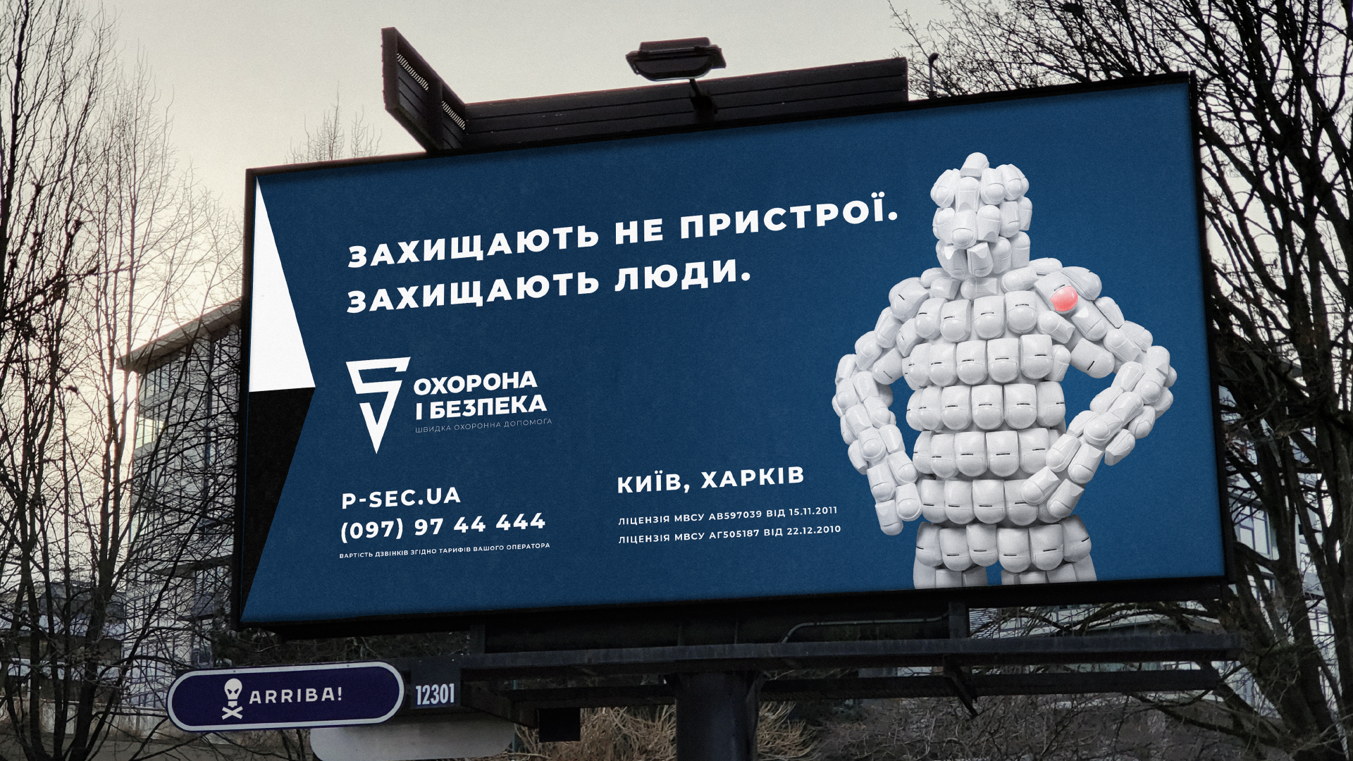
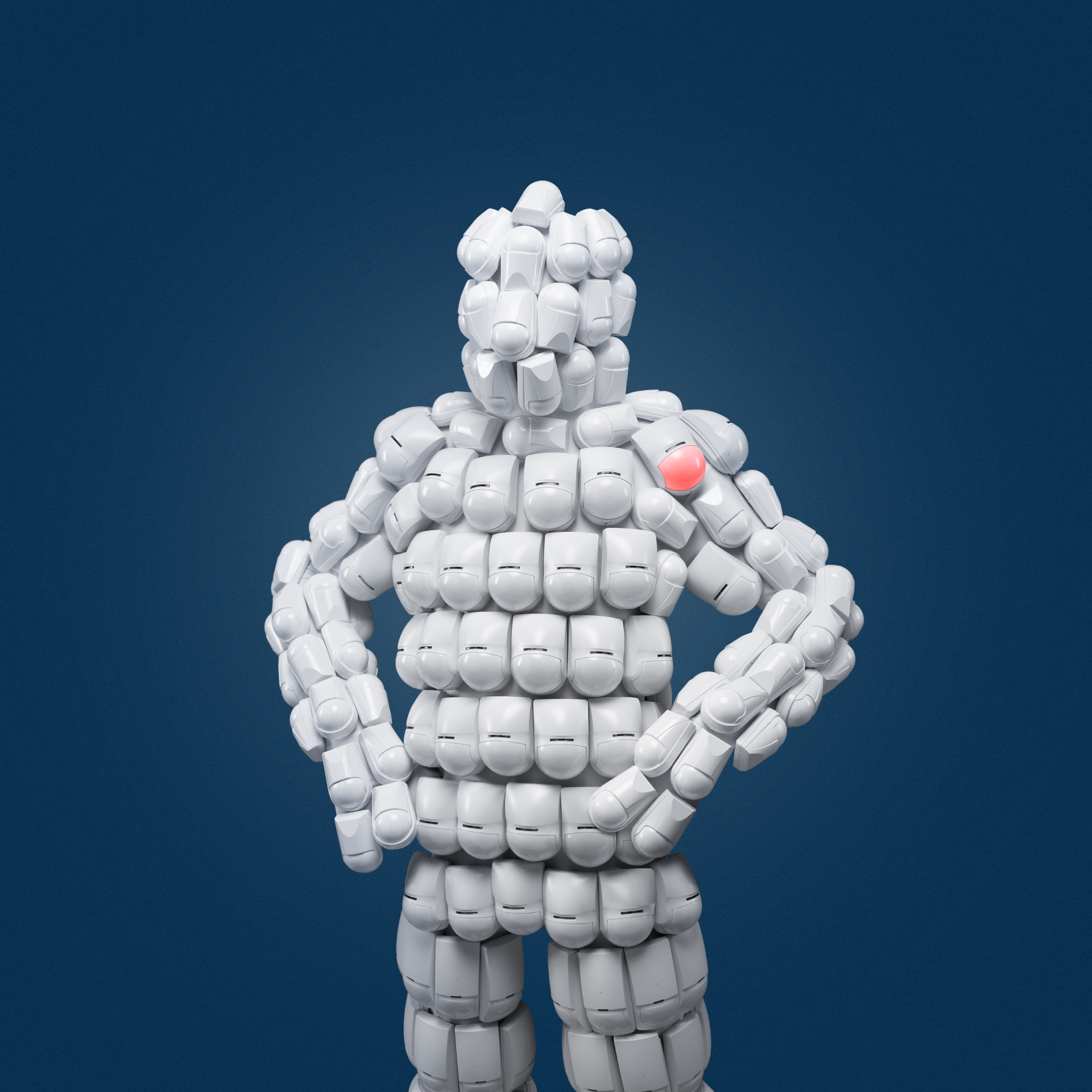
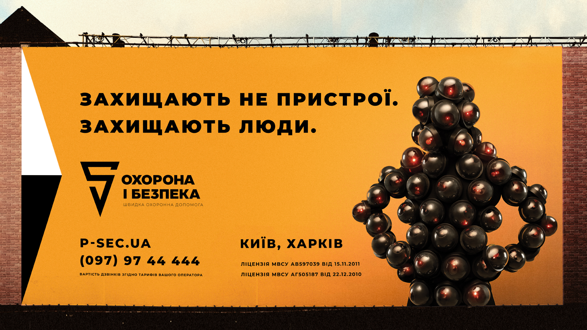
What do security agency advertisements usually look like? Harsh men in uniform, cars, frightening mottos and the contact. The closest competitors of the company went further and began to focus on high-tech devices and alarm systems.
But in reality even dozens of innovative cameras and sensors installed on the premises would be nothing as the result depends solely on the rapid response unit and how quickly they can arrive at the scene of crime. Those who protect your house are on top.
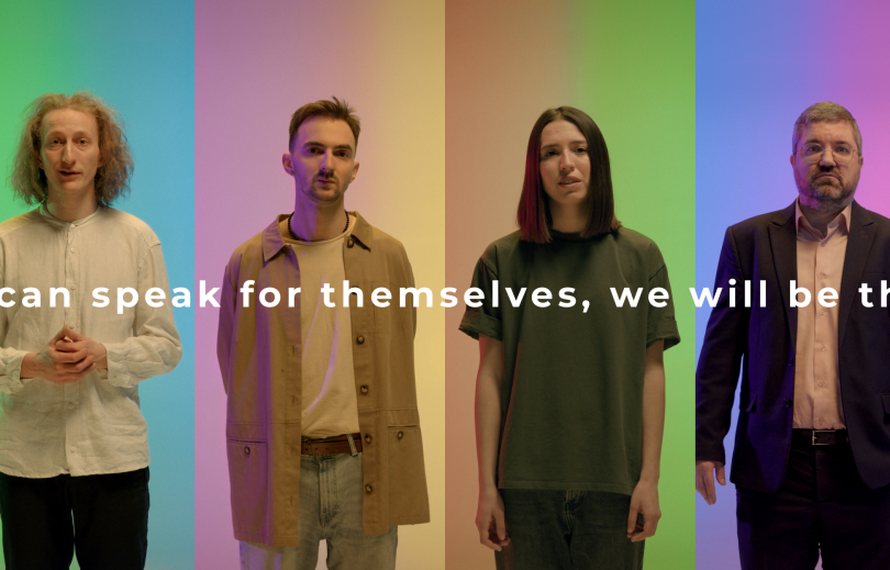
Devices do not protect.
People do it.